


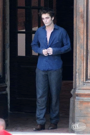


Psssst, Rob totally looks the part of a Vamp!!!
Hi all, so I thought I'd let you help me out a bit...are you game? Hope so!
Here's Bella & Edwards lovely invitation. I think it fits perfectly into their love story. It's classic, simple & a bit old world.

However, it's not my style. My main wedding color is purple...dark eggplant purple and medium purple with some green thrown in. My centerpieces are going to be purple orchids & the bouquet will most likely be deep purple & cream calla lilies. That said, I have picked out three invitations that I like. Now keep in mind the pictures I'm going to show you are not necessarily the color I want...some have it available in the sample & others you have to customize.
Please picture them all in PURPLE similar to #2 & #4...I couldn't change the color on the 1st & 3rd ones...
And if it helps, my wedding is being held HERE. Not sure if the ambience should completely lend itself to the invitations or not. My Save the Dates were purple tulip-like flowers with chartreuse stems. Clearly the invitations aren't going to match perfectly...and I'm ok with that.
#1

*In purple, not rasberry*
#2

#3

*In purple, not pink*
#4

You can # them from favorite to least favorite, or just give me your simple two-cents. Keep in mind the wording can be customized, so don't let that sway ya!
Can't wait to hear what you all think, in the comments of course.
I value your opinions more than you know.
No pressure!
PS I will eventually post which one I end of choosing!
XOXO J
Moving on......


All of the invites are pretty but based on your colors I think invite #4 would be my first choice followed by #2. I love your colors as purple is my fav. Hope the planning is going smoothly for you! Good luck...
ReplyDeletehmmm... 3124?
ReplyDeleteI don't know!
They are all very pretty ~
Every time I go back up and look I change my mind!
Good luck girl!
Hmm, that's hard. All four are pretty, but I'm drawn to #3. Beautiful choices though, I'm sure whatever you pick will be gorgeous.
ReplyDeletehi there,
ReplyDeletewow, all of the invites are gorgeous but i like the last one the best, followed by #2. i love love love purple!
great choice in venue for your reception! the bali hai has such a beautiful view of the bay. plus it has the cool retro vibe. i have a photo of my mom in cool 60's clothes standing in front of the bali hai when she was pregnant with me (late 1968).
I love all the examples, and purple & green is one of my most favorite color combinations. I keep getting drawn back to #2. I love the clear simplicity of the design.
ReplyDelete4, 2, 3, 1. In number 4 I like the square layout and how the flowers frame the text
ReplyDeleteI really like #4 for some reason. It just hit me out of nowhere...it jumped out at me.
ReplyDeleteOmg...that new BD still...(Edward looks too dead to me!!!! I got a little skeeved!!! Like she pulled him from the ocean floor. LOL! )
4
ReplyDelete4
4
4
XO
# 1
ReplyDelete# 4
# 2
# 3
All lovely!!! Isn't it so hard deciding? Everything is just so pretty!!!
I love number 2. Awwww and you're getting married at Bali Hai?!?! I love love love that place. Yummy food, amazing drinks, etc. I went to a wedding there once as well (aside from dinner a few times) and loved it! :) It was so pretty and such a fun day.
ReplyDelete2
ReplyDelete2
2
I like #1 and #3. And as the official twi-rep at your Bridal Shower, I think my vote counts. P.S. SQUEE!!!
ReplyDelete